Product driven, data informed.
While capturing data is a reasonable first step, that information means nothing if it can’t inform actionable steps.
Being data driven is a great strategy on paper, though I would suggest being “data informed” is the proper viewpoint.
Being ‘data-driven’ often means an organization is making decisions solely based on the data. While a purist would argue, anything being measured is ‘data’ the reality is most data-driven orgs don’t think or operate that way.
Rather ‘data-informed’ means that the organization is leveraging multiple inputs, including business objectives, marketplace conditions etc. In addition to the data they’re collecting.
The latter provides a more holistic picture of the problem space, the challenges and prioritizes it against those business and product goals.
This is what allows one critical data point to be a higher priority and more actionable when compared to a similar challenge. That weighting of the data through filtering it with other business factors is often what allows the reduction of the signal to noise ratio from the data you are collecting, to the the data that can inform decision making.
The business drives the change, the data should support and inform it.
What problem are you solving? What questions is the data supposed to answer?
So often while capturing data teams, including their leaders have already looked past the first and most important step — how is the data we’re collecting in service to the problems we’re trying to solve, and how is that data going to provide us actionable answers?
The data you collect should be in service of answering meaningful questions that can drive decision making. While it’s certainly true that not all questions are known, and new questions will arise in discovery… having the team in alignment streamlines and prioritizes the collection and useful output of that information.
Too often “the perfect dashboard” is designed to look beautiful in concept, and in the perfect scenarios… but the actual data looks wildly different and drives little to no actual value to your users… meaning it’s not driving value for their business, or your product or service.
The process
At a glance…
Step 1: Data Discovery
Before diving into dashboard creation, it’s essential to start with a thorough data discovery process.
Step 2: Delivering meaningful data
Once you’ve identified the critical data, the next step is to present it in a meaningful way.
Step 3: Learn, iterate and improve
Creating effective data visualization is an ongoing process, one that when cultivated properly allows for richer, deeper insights as you can provide a more holistic picture from your data.
Step 1: Data Discovery
“Above all else, show the data…” – Edward Tufte
What’s the story, morning glory?
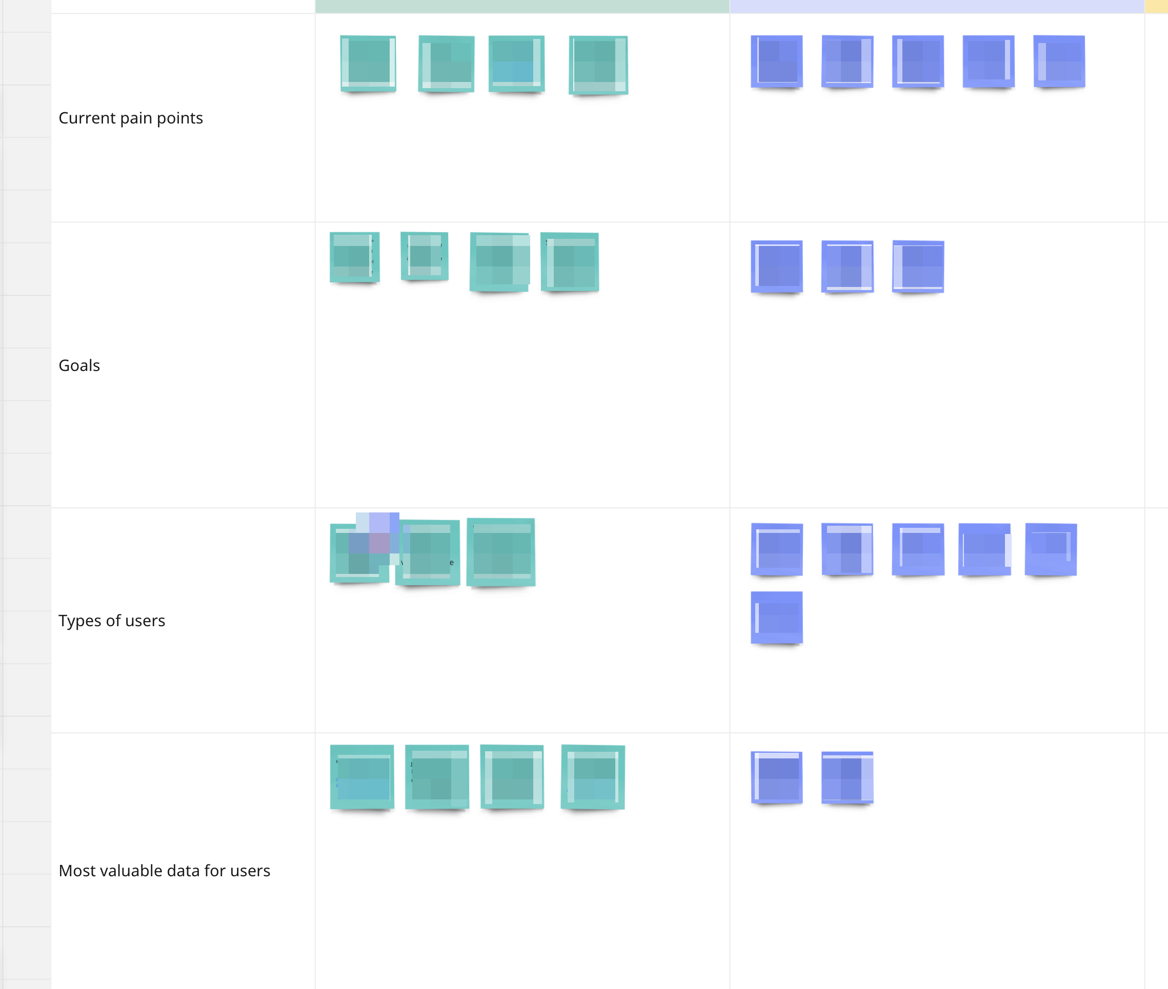
Understanding the problems your users are trying to solve, and the insights they need in order to take action to solve those problems allows the team to start to build their “data story.”
Gathering stakeholders, and various teams together that are your customer touchpoints, like you should with any project with customer impact… data visualization should be no different.
Identify the key questions your users need to answer:
- What information is missing that’s not allowing your users to take action?
- What are their main pain points? How does the lack of information, bad information etc contribute to those challenges?
- What at a glance information is missing that would allow them to take quick tactical actions?
- What information is missing that would inform larger strategic goals and initiatives? Or help them prioritize based on current trends?
Understand the insights that will inform users’ decision making.
Look to go beyond surface-level metrics and understand what data you could drill into, dig down and provide more details on that would allow for a user to take concrete action on a problem or a trend they’re identifying. Rather than showing total sales numbers, show trend information to drive context, or develop metrics that transform the data into defining customer lifetime value, over time, to help inform strategic decision making.
Assess the usefulness and availability of your current data.
Just because you’re collecting data already, doesn’t mean it’s good or useful in its current form. In addition, do users have questions for which you don’t yet have the data to be able to provide meaningful answers? Figuring out the delta between what data you have, how useful that data is, and what data you’re lacking will allow you to prioritize and set the proper roadmap in identifying what data may be able to be available when, removing bad data, identifying the gaps and inconsistencies so that they can be addressed.
Evaluate the feasibility of acquiring additional meaningful data.
The last step once you’ve talked with users, identified their challenges, understand what they need and done an audit of your current data, is to assess the feasibility and level of effort in acquiring additional data points. What new processes, new tracking or methods need to be put in place in order to acquire that information, and what’s the level of effort in acquiring that data, and maintaining that process? That could mean collaborating with other departments, or APIs or building new mechanisms to capture the information requested.
Discovery should be about identifying the story that your data should be helping to inform and executing on a plan to provide that information in a meaningful way.
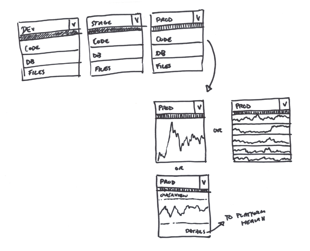
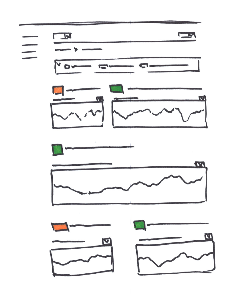
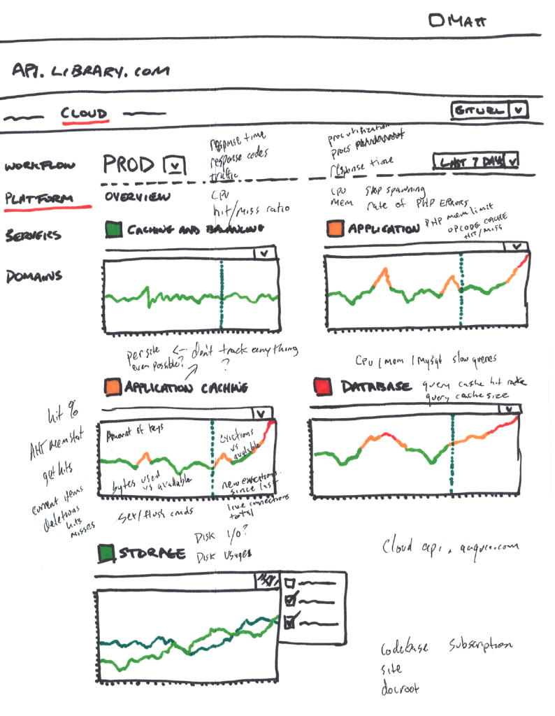
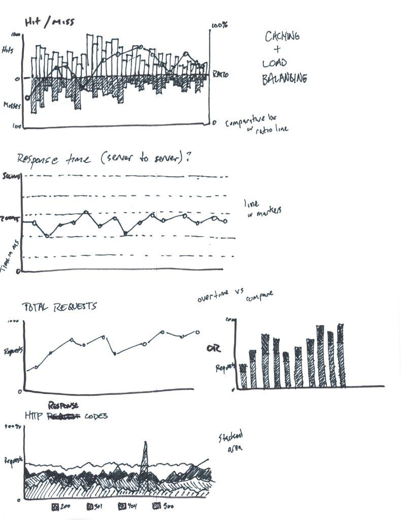
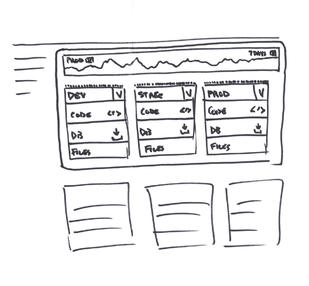
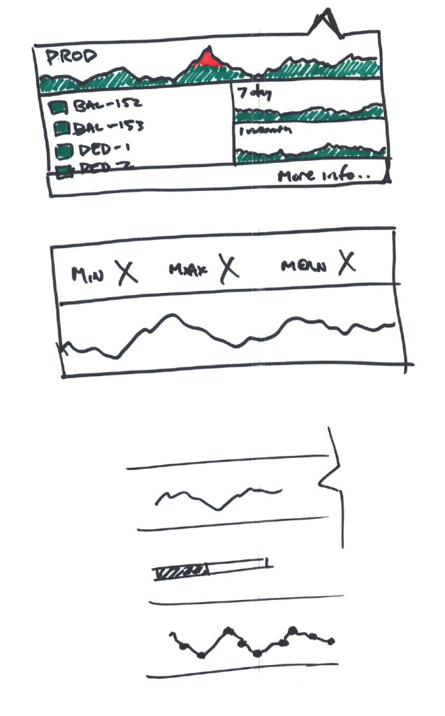
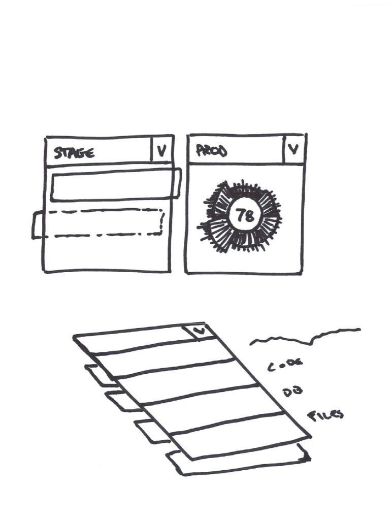
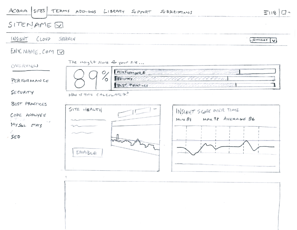
Early design concept examples
Step 2: Delivering meaningful data
Cut through the noise, and focus on delivering data in a contextual, comparative and connected way. Leverage interactivity to your benefit and don’t treat your visualizations as a static lifeless object.
“Clutter and confusion are failures of design, not attributes of information.” – Edward Tufte
You’re my wonderwall…
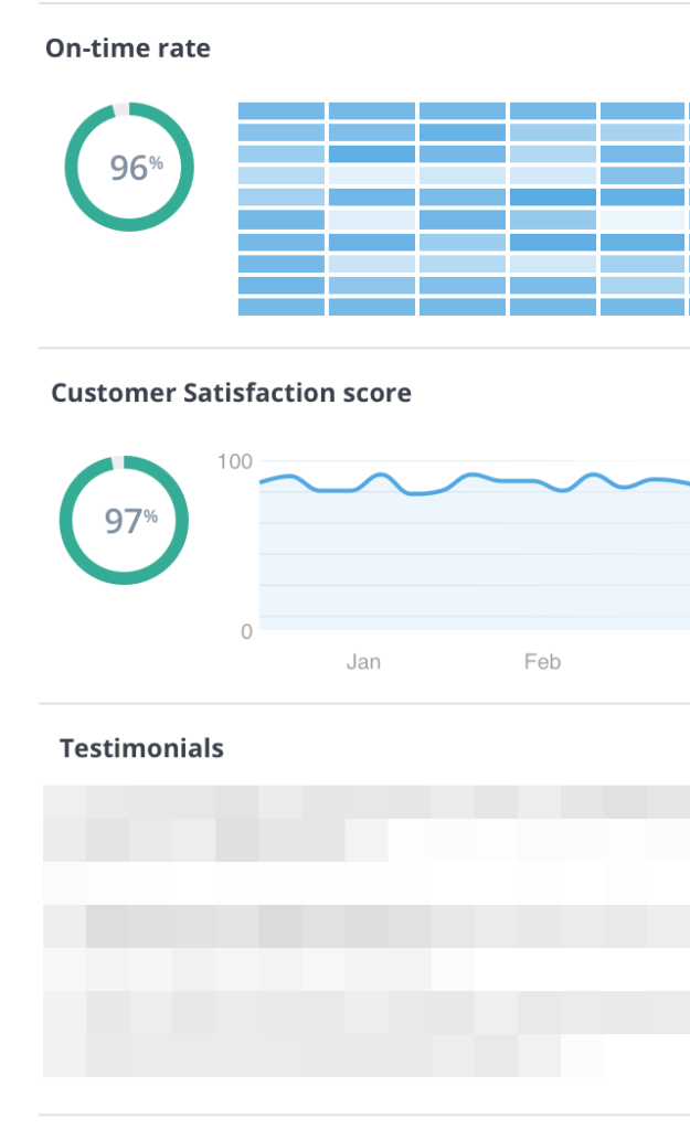
Context is king. Providing data without contextual awareness means that only the people that fully grasp the information can understand it’s meaning. It’s important to provide multiple facets of information that together can tell a more holistic picture of not just what is happening, but provides insights into why it’s happening.
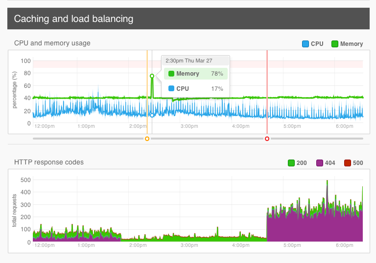
Slow response time on a server that’s serving pages to users is one thing, understanding that there’s peak demand, or that there’s breaking news causing the demand allows someone to not only address the problem. They understand why the problem is occurring so they can address it properly with the correct fix.
Customer sentiment is trending downward while your shipping times and shipping damage claims are increasing drives actionable insights that you may have a shipping carrier problem to address.
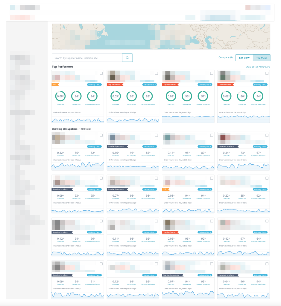
Design for comparison to drive context
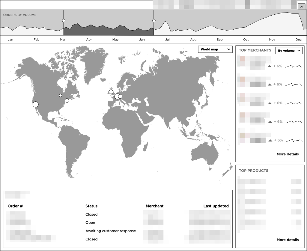
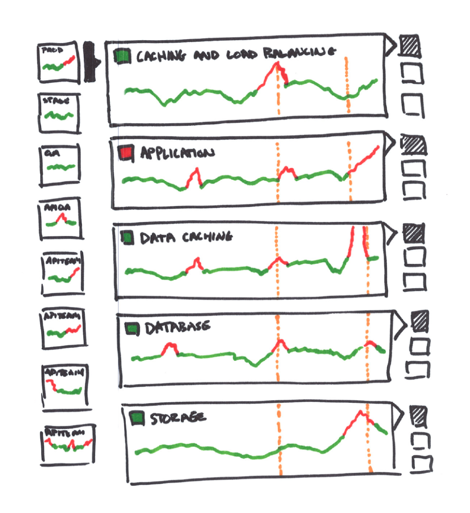
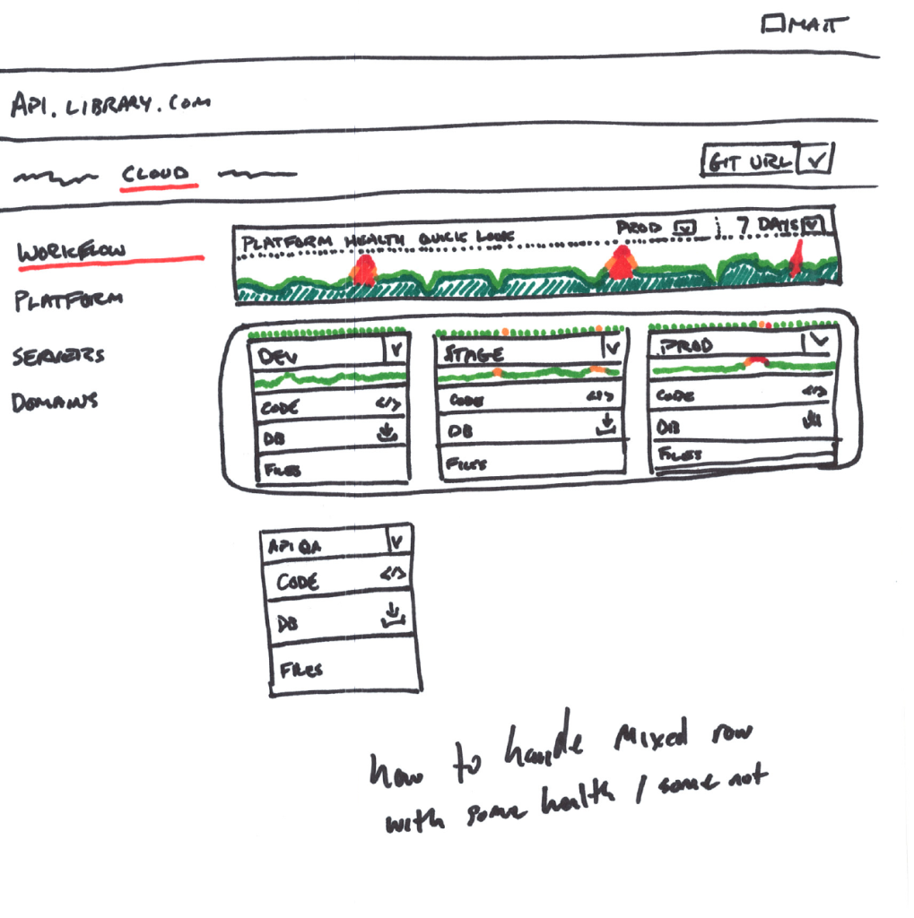
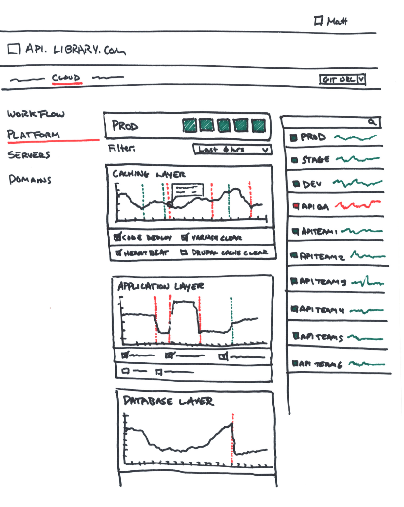
- Enable users to easily compare different data sets, while keeping time series data synchronized across graphs so there is a clearer understanding as to the relationship of certain events.
- Provide side-by-side views for time-series data when comparing different Information, such as different product categories or error rates over the same time periods.
- Overlay that information if comparing similar data such as the count of orders to the count of claims rates for given days. Making the information more easily comparable when the data can be tracked against the same scale.
Highlight anomalies and outliers
- Make it clear and simple for your users to spot unusual patterns and outliers in the data. Encourage exploration and drill down of data to further identify anomalies.
- Using gestalt principles of design – use color, size, shape, proximity to your advantage to enforce similarities and highlight the differences. Alerts, overlays, icons that can provide meaning and add further depth, information and action to the data are important. Be careful to not overwhelm the user or create more visual noise or the message will be lost and the important actionable information will go unnoticed.
- Consider implementing and allowing for the identification of thresholds, to more easily identify areas outside operational norms.
Focus on outcomes not just output
- Rather than just focusing on raw numbers, like sales or orders for the past day, or month, provide the context by showing trends and targets. How far off are those sales from the week, month or year prior? How close are they to the quarterly projected targets? How much time is left to reach those goals? Does that goal seem to be in good shape, or is it in jeopardy of being short?
- Suggest actionable next steps based on the current status of the data, allow a user to drill into that data for more insight such as providing a filtered list of related items when interacting with the total number of orders, or claims, or items being processed.
- Leverage the data to drive intent and provide further context. When a user interacts and digs deeper, leverage that intent and provide deeper context.
- The more the organization and team understand how the data they’re capturing is being leveraged, the better equipped they’ll be at delivering information that not just displays data, but it does so in a meaningful contextual way.
Get interactive
- The web hasn’t been a static medium for a long time. Leverage it. Whether on mobile, tablet or desktop there are ways to drive interaction with data visualization.
- Drilling down deeper from one graph scoped to the next, overlaying various data sets.
- Support gestures where appropriate to drive interactive exploration. Pinch to zoom, pan etc.
- The ability to sort, and filter information including the addition and reduction of columns in tabular data allows a user to drive the focus and cut down on the noise to be able to focus on their specific questions for their area of focus. The same data doesn’t need to be one size fits all when it can be designed to accommodate different personas.
Time series data good, pie charts bad
- Not all data is created equal. While most information in dashboards can have some reliance on time, keeping the time series in sync across your graphs allows for easier comparative understanding to be drawn around anomalies and events across multiple data points.
- Multiple studies have shown that not all visualization representations are created equal, while a pie chart is a good representation of how much pie one might have eaten, or pizza for that matter… it is not the best representation when displaying multiple items as the wedge shape that is created is difficult to parse in comparison to the other wedges.
- The same can be said for 3D extruded graphs or isometrically displayed information – while they may look interesting, they can be deceiving and misrepresent that data they are displaying.
Ensure accessibility
- Data doesn’t discriminate, neither should our visualizations of that data. It should be available an accessible to all team members in various forms.
- Consider icons to drive meaning in addition to color esp for errors and areas of focus to support those that are color blind.
- In addition, provide text alternatives for visual elements that can better describe the information being presented for those with other visual and fine motor impairments.
Step 3: Learn, iterate and improve
Creating effective dashboards and data visualizations is an ongoing process. As the deeper understanding of the problems evolve, so to must the data and how we visualize it to continue to provide more meaningful impacts on what and how to take action.
“Graphical excellence is that which gives to the viewer the greatest number of ideas in
the shortest time with the least ink in the smallest space.” – Edward Tufte
Hey now!
While accurate data is essential, actionable insights of that data is the goal. The first, second or even third pass at displaying information to provide context is likely not it’s final form of display. Continuously seek to understand new questions that arise from talking with your users.
Implement feedback mechanisms within your dashboards and data displays, regularly schedule feedback sessions with the same internal stakeholders that were critical in step 1 in defining the problem space and questions that would answer it. Build continuous feedback loops with users.
What generally happens, as one question is answered… 3 more pop up… now that they have this information, they seek deeper understanding and build a better opinion of causal relationships. It’s therefore critical to build those feedback loops early so you can gain valuable insights into their data discovery journey to understand why they’re making certain suggestions — as you fully understand the new problems they’re trying to answer.
It’s not about seeking new suggestions, it’s about becoming experts in their challenges.
Prioritize data insights over mere data capture.
Foster a culture that rewards your team and your users to look beyond the raw numbers and focus on extracting the meaningful insights that are the factors that drive decision making.
Provide training and resources on good data practices and proper interpretation of decision-making from the data being displayed — make sure your users have a clear understanding of what the data displayed is — and what it isn’t.
Eat your own dog food
Many systems are created and launched where data capture is an afterthought, and shockingly data dashboards tend to be one of those places ironically. More time is spent in how to capture what needs to be displayed, than understanding and measuring the behavior of how users are engaging with what you’re displaying. Implementing analytics to track behavior on what areas your users are interacting with can allow you to dig further into identifying if your solution is fully satisfying their needs. Do they want to drill deeper, do they barely interact with a few graphs because they’re good at a glance information — or is it because the information isn’t valuable. The latter is the kind of question talking to your users can answer, but you’ll only know the question to ask if you’re measuring their behavior when they’re interacting with it. Understanding what they’re doing is important so you can understand why they’re doing it.
Stay informed
Data visualization is ever evolving, with new ideas and ways to display complex information always being explored. Contribute your ideas and explain how you approached the problem and why this new graphical representation was best suited where others may come up short. Only by contributing and being involved in the space can you truly evolve your craft and your thinking about how to display data as the peer review and feedback process will require you to challenge your own thinking in response to inquiries. Design reviews are what make designs stronger, the display and communication of information clearer, and the core differentiator between design, and art.
Infographics vs SaaS dashboards
How you apply these steps differs greatly in the message you’re conveying and the constraints you have with the medium.
Some might say
Some of my favorite data visualisations come out of the team at NYT interactive. The way they approach interactive infographics is some of the best, most creative work in the space.
That said, most users interacting in a SaaS product setting are task based and action oriented. They’re not looking generally to spend time exploring and gaining knowledge, but rather need that knowledge readily accessible, in near real time delivered in actionable ways.
Scalability
Ensuring that your infrastructure can handle the demands of growing pipelines of data ingestion into a proper data lake, and that it can be accessed through the proper data warehousing tools that are relevant to the types of data that’s being collected is critically important.
Inefficient data processing, or poor balancing of caching vs real-time performance can impact the availability, reliability and suitability of the experience your team took so long to perfect.
Progressive loading
Not all data is created equal, and it’s likely coming from different sources with different levels of latency. Waiting til the entire payload of information is available to display it can cause your users to feel the experience is slow, non-responsive or even down and not available. The time from the first paint of the page shouldn’t be hindered by when data is available to be displayed. Lay out the page, provide affordances to inform the user that graphs are loading, and in areas where data sets requested are especially large, inform the user that it may take some time. While having everything load instantaneous is ideal… such a thing is not always realistic, or practical. If someone asks for 50 years of data, unless previously cached or compiled, such a thing will certainly take some time over the default time series range that you’ve optimized for.
As near real-time as your users need
SaaS applications generally demand as real-time of information as possible. If there’s a problem it needs to be informed on as quickly as possible to reduce the impact, and allow for the greatest amount of time to address and fix the problem. Waiting mins, hours or even days in some situations can cripple a business. That said, not all data requires that level of precision regarding the actions that are generally taken. Polling rates can be lowered in situations where actionable steps are less frequent, or there are longer lagging indicators to determine trends and support problem analysis. In those situations hourly, or even twice daily polling might be sufficient where near real-time is an unnecessary burden that drives very little tangible value for the user.
Consider how and where else this data is used
Data visualization and data dashboards are great tools, but let’s face it — your users aren’t in your applications 24/7. Understanding how else this data could be leveraged, what other integrations or ways to extract the data for it’s inclusion in your user’s own tools and systems will not only make the data more actionable, but it makes it more valuable.