Timeline:
2016
Role:
Senior UX Manager (IAM)
Deliverables:
- Design and UX direction, strategy and oversight
- Facilitation, and ideation
- Project management
- Team lead
- Managed global team of 6
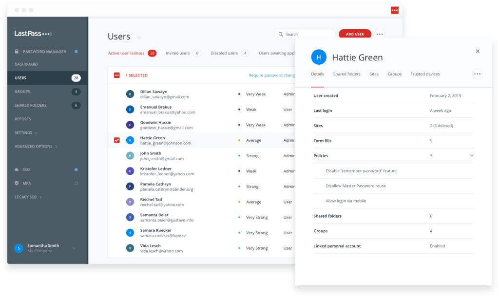
In early 2016 soon after it’s acquisition by LogMeIn, while the consumer product got some new workflow and UI improvements… the Enterprise version largely lagged years behind due to feature bloat and a separated management tech stack.
The goal was to change that, and start work on a version of the enterprise solution that would bring it further in line with its consumer counterpart that users were accustomed to.
The background

LogMeIn finalized the acquistion of LastPass in late 2015, just prior to my joining the team, for which work on the consumer product’s refresh was already under way when I joined. As the Senior UX Manager of Identity and Access Management (IAM) had purview and responsibility over the UX strategy and direction for LastPass and several other LogMeIn applications.
LastPass is a password manager that operates as a standalone application and browser extension to securely generate and store login information, along with other sensitive data securely.
* As a side note, I won’t be addressing any recent security related matters in this overview, occurring both before and after my time with the organization as I have no direct knowledge of those incidents or how they occurred. *
The process
In an effort to address the challenges seen by the team in an effort to hit growth targets for the product, Enterprise was seen as a critical building block to that growth, but the product lagged behind competitors in usability and ease of access. The features were there, but they were often hidden, or overwhelming… or both.
Ideation and discovery
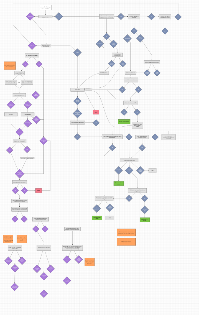
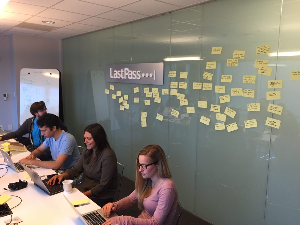
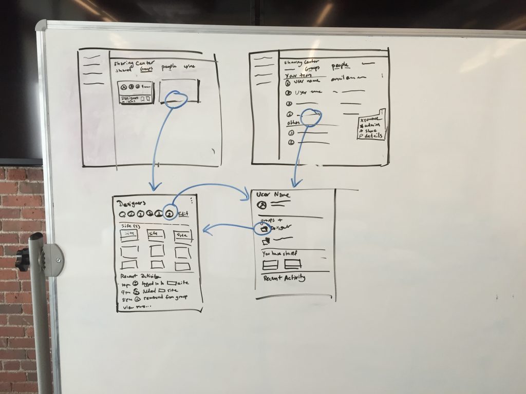
We began documenting steps and defining pain points that could be improved. Including meeting with the team, shadowing support on site in Virginia and numerous brainstorming and ideation sessions to identify and prioritize the important differentiators between the enterprise and consumer versions of the product.
We then ran multiple design sessions to flush out the direction, workflows, layouts and ultimately the core of the design philosophy. While in parallel holding focus groups with enterprise and consumer users for the team to build a stronger understanding of personas and their differences.
Onboarding matters too
In the course of our discovery work we learned that the critical stickiness factor for continued usage was to build the habit of leveraging a password manager ideally within 72hrs of installing it. If the users didn’t leverage adding 5 sites to it within a week, the likelihood of continued engagement dropped off significantly.
QR codes and ingestion wizards to the rescue
- The goal was to build trust quickly, we knew from talking with users they were hesitant to store sensitive information, rightfully, in something they didn’t trust.
- We build multiple workflows that would allow them easily walk through an add a few sites, in addition to adjusting the marketing and product imagery to provide a more human connection.
