Timeline:
2014 thru 2015
Role:
Principal UX Designer
Acquia Cloud UX Team Lead
Deliverables:
- Research and Discovery
- Workflows
- IA restructuring
- Wireframes
- Prototyping
- User Interface design
- Design and UX direction, strategy and oversight
Long identified pain points in the company’s flagship offering lead to a multi-year undertaking to evaluate the entire experience and rethink it from the ground up.
The background
Acquia, a digital experience company that provides website and hosting solutions powered by Drupal, an Open Source CMS system powering some of the biggest websites in the world, was in itself co-founded by the creator of Drupal in 2007. When I joined in 2012, we were going through a large uptick in growth for a startup, and would grow significantly in the years to come.
My role evolved over the years as a lead designer on multiple projects to a team design lead, coordinating multiple designers and researchers along with product managers and developers.
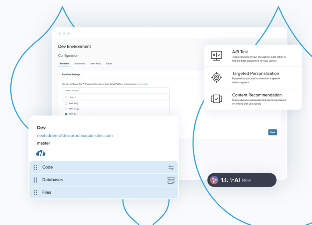
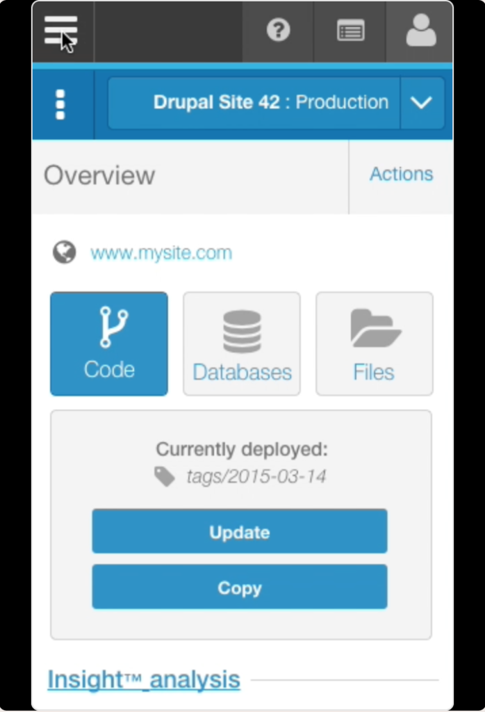
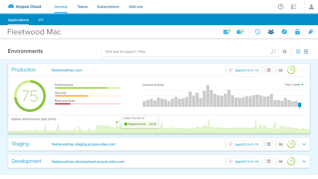
Acquia Cloud, one of it’s flagship products that supports the ability to host, and maintain a complex cloud infrastructure to support Drupal, included many developer centric features to aid in the ease of testing and deployment of code changes that powered customer’s sites.
The core user persona for Acquia Cloud is a developer, while the buyer tended to be a CMO or marketing department looking to better engage with their end customers to sell products, promote musical artists, deal with regulatory or governmental affairs… the list of use cases for how businesses leveraged Drupal was, and still is vast.
The challenge was that Acquia Cloud hadn’t kept pace with the scale of it’s customers, the UI and supporting services didn’t easily support how it’s customers were looking to leverage complex experiences, with multiple branches of code deployments, databases and environments.
Understanding the problems
As the organization grew at breakneck pace, the customer’s needs quickly outpaced the adaptability, flexibility and scale required for our customers to operate.
Outdated
Customers felt the experience was outdated and slow.
Difficult to use
Was challenging to use to do tasks they saw as simple, that required additional steps to complete.
Experience didn’t scale
Enterprise customers wanted to use hundreds of databases, and the UI was never designed for that kind of scale.
Wasn’t responsive
Users were limited by a fixed experience that didn’t adapt to various needs.
Forced workflows
While the product had a point of view, it lacked flexibility for users that preferred different workflows.
The process
Acquia, a digital experience company powered by Drupal, that at it’s core supports an Open Source CMS system powering some of the biggest websites in the world, was co-founded by the creator of Drupal in 2007. When I joined in 2012, we were going through a large uptick in growth for a startup, and would grow significantly in the years to come.
Acquia Cloud, one of it’s flagship products that supports the ability to host, and maintain a complex cloud infrastructure to support Drupal, included many developer centric features to aid in the ease of testing and deployment of code changes that powered customer’s sites.
The core user persona for Acquia Cloud was a developer, while the buyer tended to be a CMO or marketing department looking to better engage with their end customers to sell products, promote musical artists, deal with regulatory or governmental affairs, the list of use cases for how businesses leveraged Drupal was, and still is vast.
The challenge was that Acquia Cloud hadn’t kept pace with the scale of it’s customers, the UI and supporting services didn’t easily support how it’s customers were looking to leverage complex experiences, with multiple branches of code deployments, databases and environments.
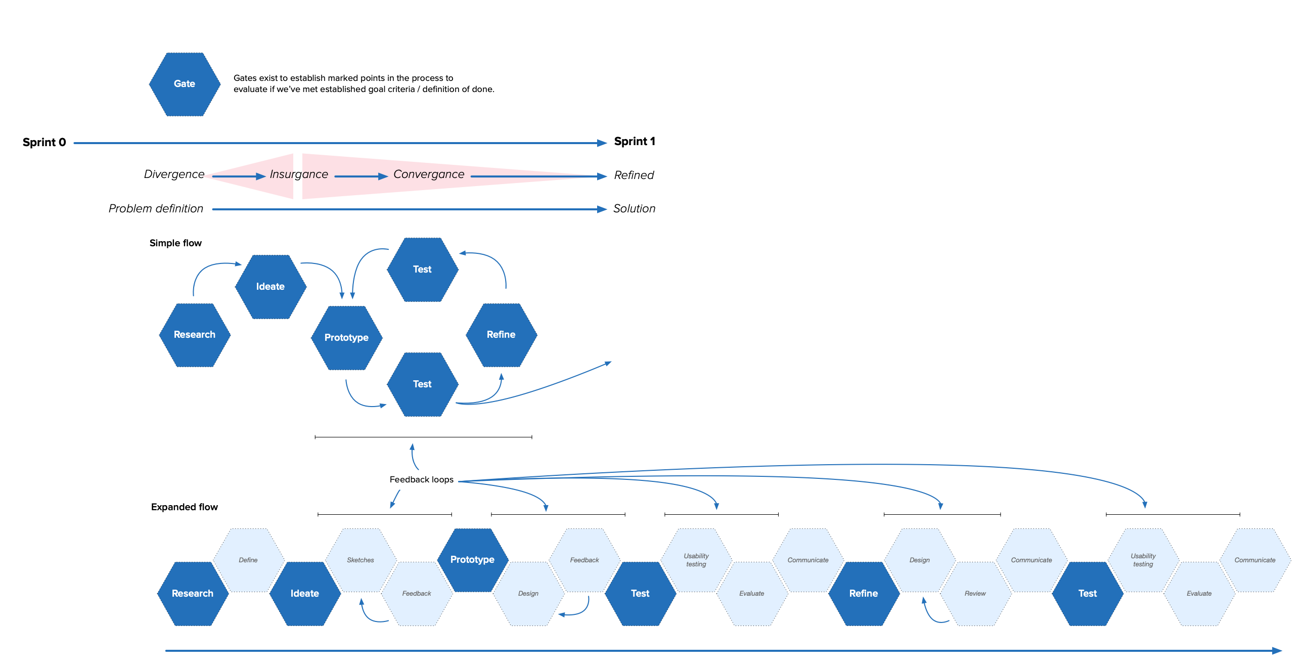
Learn, iterate, repeat.
The team, consisting primarily of myself, a dedicated UX researcher, and a few other designers, took an interactive, iterative approach – testing early and often with a wide variety of users to understand and validate current pain points, and test whether solutions we were prototyping were resonating.
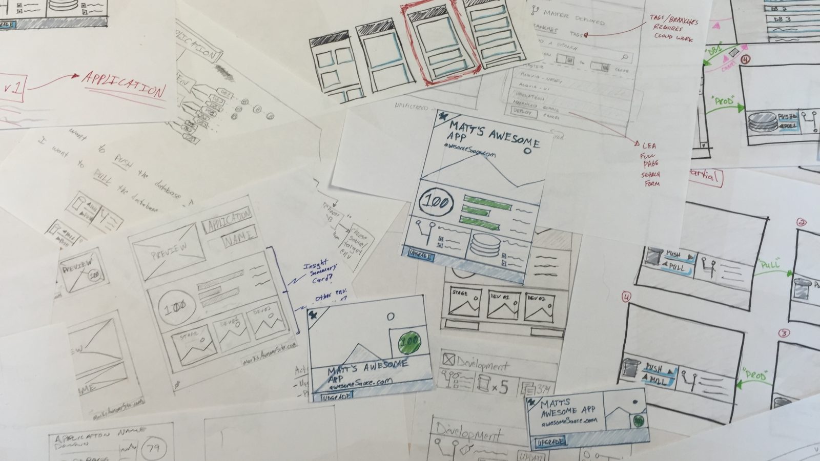
Paper and whiteboard first. Computer second.
- Lots of sticky notes.
- Multiple design sessions mapping out the proper workflows based on user feedback.
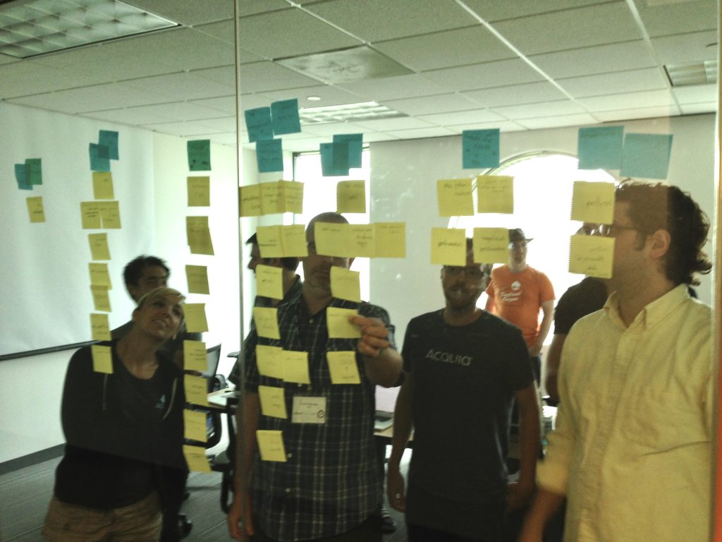
Collaboration and group brainstorming
- Collaboration and brainstorming with multiple departments, including engineering, customer care, product marketing etc
- Understanding what each group saw as the challenges and where each group ranked issues was important for Product and UX to make sure we were tackling the most important problems.
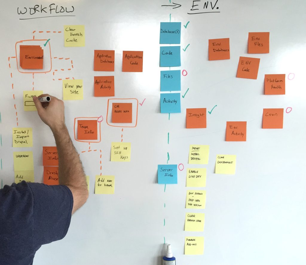
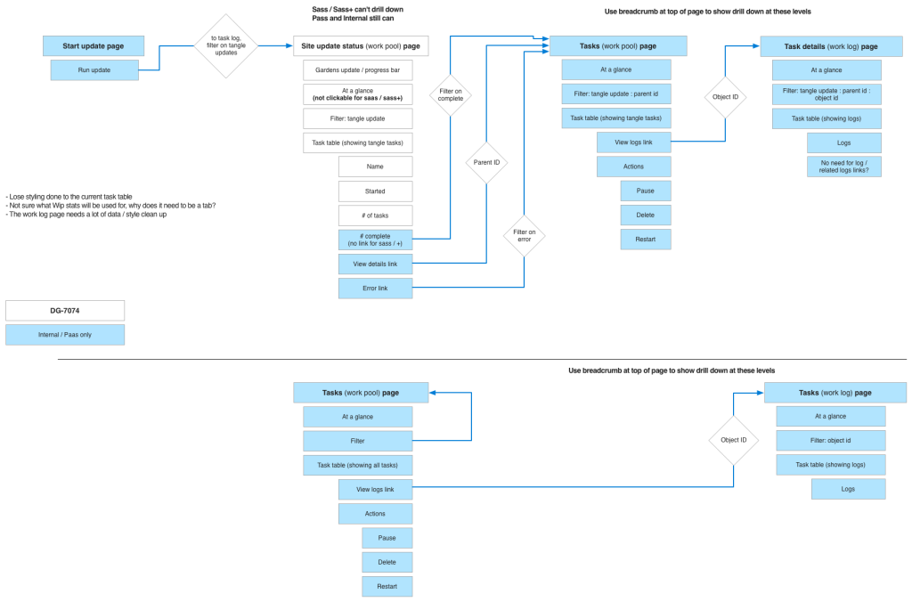
Workflows, a lot of remapped workflows
- All current tasks had to be accounted for.
- Better organization, accessibility and access were a main priority.
- We identified “High Priority Tasks” that were deemed to be the most important or critical tasks a user would need to perform routinely without fail. These tasks were accommodated first, grouping other tasks with them as appropriate.
Mobile-first approaches
- Mobile-first was important an important mandate.
- We wanted to make sure that our users could tackle problems and challenges no matter where they were when they arose. Dealing with them swiftly and efficiently as you can’t plan when problems arise, and they’re often when you expect them.
“Once I found the ‘actions’ thing, it was easy…”
– Early prototype usability participant regarding buried wayfinding issues.
Testing, testing and more testing.
The team, consisting primarily of myself, a dedicated UX researcher, and a few other designers, took an interactive, iterative approach – testing early and often with a wide variety of users to understand and validate current pain points, and test whether solutions we were prototyping were resonating.
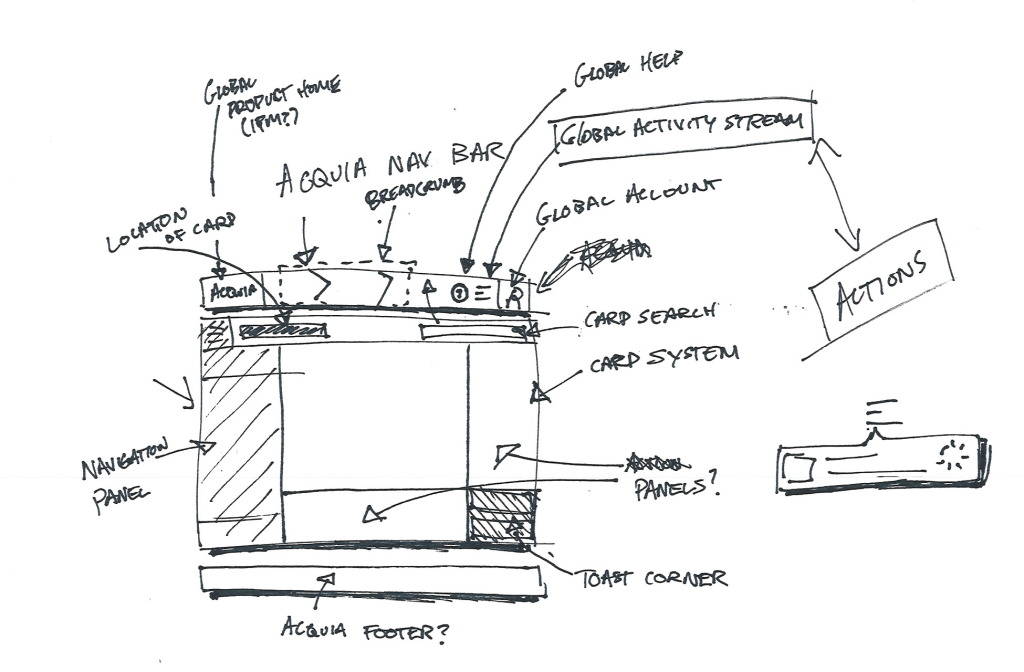
Sketching, then prototyping
- Once we had a strong understanding internally and externally of the needs of our users, and where we were falling short… then we started sketching.
- Group sketching, along with solo brainstorming sessions allowed us to incorporate new ideas quickly while giving designers a chance to think and develop concepts on their own.
Mobile device prototypes
- While mobile-first was important, so was real device testing vs theoretical screen testing. We wanted to see how devices worked in people’s hands, what they struggled with, and what worked well.
- Paper gave way to rich Azure and Invision prototypes that ran on device.
What we learned…
Through numerous rounds of research, one core question kept coming up with two camps strongly entrenched in the belief that they were right… does a developer want to “push code” — i.e. initiate the delivery of code from one environment and select the target environment they’d like to send it too…. or “pull code” i.e. initiate the retrieval of code from the target enviroment and choosing which environment they’d like to get the code from.
The initial belief was, there must be a strong winner within our customer base, and we should align our thinking to how our customers are looking to accomplish this. A strong hypothesis built from the tenants of good experience design. What should have been clear to us at the time, is in the same way we had two very vocal internal groups each insisting they were right…
The rest of our user base was equally split. In numerous rounds of testing, in an effort to bring focus and a point of view to our UI, to streamline it… every usability testing session, every customer survey focusing on behavior… it was a statistical 50/50.
There was no strong majority. Some people see the glass half full, some half empty. Some like to push code, others like to pull it.
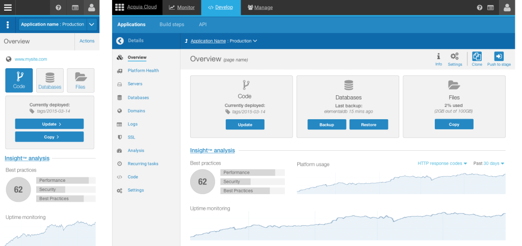
Polish and delight
Along with myself, and 2 UI contractors and 2 front-end developers we moved foward on a new visual language and design system that would support the new application framework and thinking. We called it Elemental.
Clean design. New typography.
- Once we had a strong understanding internally and externally of the needs of our users, and where we were falling short… then we started sketching.
- Group sketching, along with solo brainstorming sessions allowed us to incorporate new ideas quickly while giving designers a chance to think and develop concepts on their own.
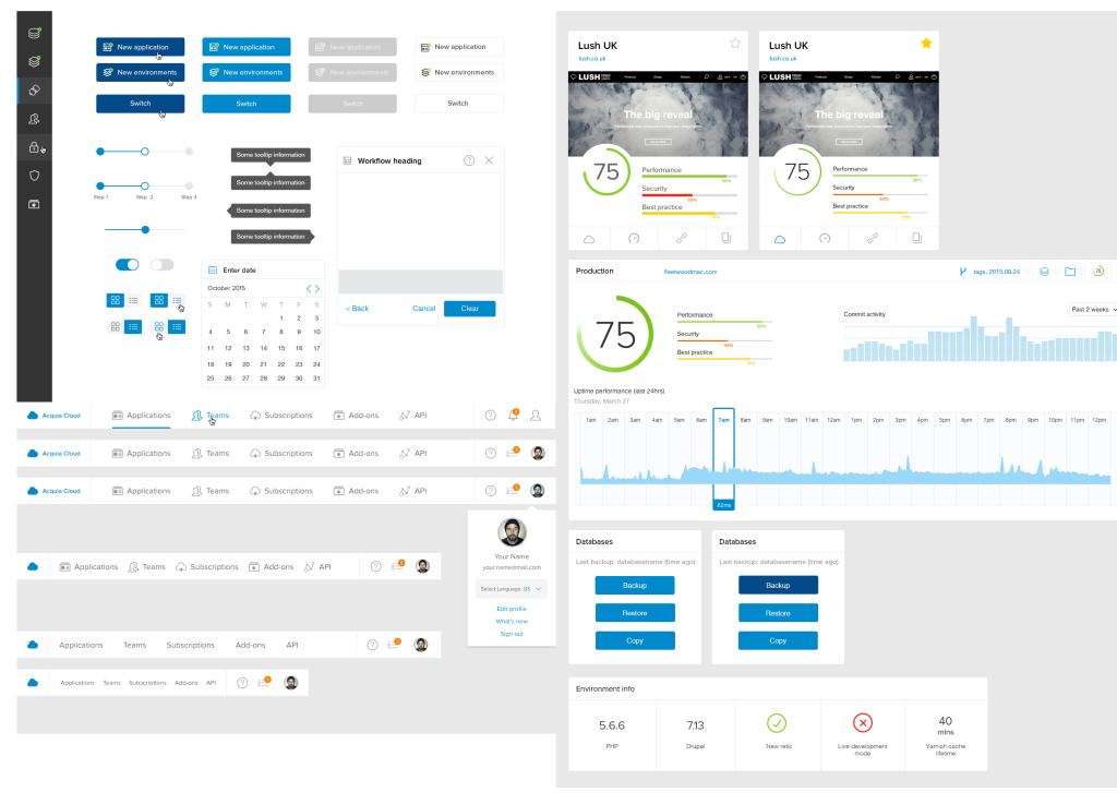
A system of components
- It wasn’t just about the style of the elements, but how they behaved, interacted and communicated to the user.
- New typography, new interaction definitions for how things moved, and provided feedback to the user were introduced.
The result
What launched in 2016, was not just a new UI, but a dramatic rethinking of how we structured the entire experience, that would let someone deploy code from their phone, or debug an issue, or rollback code but something that has stood the test of time with core elements of the design experience still largely intact as a testament toward understanding and solving the right problems. Doing so led to an improved customer experience, higher satisfaction and in no small part as it’s flagship product, no doubt helped lead to a $1 billion dollar evaluation for Acquia before being acquired by Vista Equity Partners in 2019.